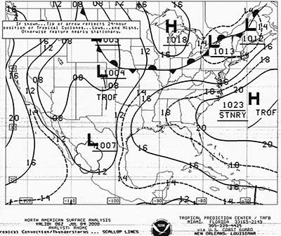
Surface Weather Analysis Chart
Introduction
Historically, the surface weather map was the first weather map produced, dating back to the early 19th century. Even today, it remains the one of the most useful charts for ascertaining the current weather conditions just above the surface of the earth for a large geographic region. These maps are called surface analysis charts if they contain fronts and analyzed pressure fields, with the solid lines representing isobars.
Synoptic Weather Observations & Analysis
Because many of the surface weather maps display weather conditions at a particular time, these charts can be considered one of the varieties of synoptic charts. The word "synoptic” is derived from the Greek words syn meaning the same or together and "optic" meaning visible; hence, seen together. Synoptic weather analysis requires the simultaneous observation of the weather at many widely located sites using standardized instruments and techniques. By international agreement all meteorological observations are taken at the same time according to Universal Coordinated Time (UTC) or Z time
You should look at the title of the chart to determine the time of the chart. Most of the charts will list the UTC or Z time when the observations were made. The weather data that are plotted on many of these surface weather maps are based upon the hourly surface observations that are made at many airport weather stations. These observations are made within 5 minutes of the top of the hour. The frontal analyses that may appear on the surface chart are usually produced at 3 hourly intervals (0000 UTC, 0300 UTC and so forth).
Data Display
The simplest weather chart would represent a plot of one weather element (such as air temperature), using the observations of that element made at many locations at the same time. An operational synoptic weather chart of the surface weather conditions often is a composite chart that includes the spatial distribution of several weather elements that have been concurrently observed. Some of these weather elements that are displayed on surface weather maps include the air temperature, dew point temperature, air pressure and wind information (wind speed and direction).
Some of the surface weather maps that are presently available may contain an overlay of the current radar or satellite imagery.
Surface Station Models
A display of all this information for many locations at one given time would be difficult to make and interpret unless a uniform system of plotting was adopted. The pictorial presentation and weather data together with an analysis can be determined at a glance. The location of each reporting station has been printed on the base maps as a small circle. The weather data from each reporting station are plotted around these circles on these base maps in a particular systematic fashion called a "station model". A sample station model for a weather observation station, complete with the proper position of the weather data:
The following discussion is intended to help you decode and interpret a surface weather map that contains abridged station models.
Temperature and Dew point Temperature Conventions
In the United States, the current near-surface air temperature and dew point temperature are reported in whole (or integer) Fahrenheit degrees. These temperatures are measured by instruments located in a standard instrument shelter at a height of approximately 5 feet above the ground. The air temperature is plotted on the chart to the upper left of the station model, while the dew point value is placed below the temperature entry, or to the lower left of the station circle. A negative sign is included when the air temperature or dew point is less than 0 degrees F. The value of the dew point may never exceed the air temperature.
Wind Conventions
The observed near-surface wind speed and wind direction, are represented on the map by a combination of a wind arrow shaft and wind barbs around the station model. These wind data are obtained from a standard "anemometer height" of approximately 30 feet above the ground. The "wind arrow" is a symbolic back portion of an arrow that "flies with the wind"- the wind barbs located on the tail of the arrow are upwind, while the small circle at the head of the arrow is located at the station. Thus, the orientation of these wind arrows on the map indicates the wind direction to the nearest 10 degrees, measured clockwise from true north (defined as 360 degrees, and located toward the top of the chart). By meteorological convention, the winds are named for the direction from which they are blowing. Hence, a south wind is from the south.
The number and length of the barbs on the tail of the arrow indicate the near-surface wind speed in knots (nautical miles per hour, which are 15% larger than the familiar statute miles per hour) using the following convention:
Barometric Pressure Convention
The current sea level corrected air pressure is plotted on the map to the upper right of the station model. The numeric pressure entries are in units of tenths of millibars. The barometric pressure measured by a barometer at the station is adjusted (or corrected) to sea level conditions to eliminate the variations in reported pressure due to the altitude of the station.
By convention, the lead "9" or "10" is dropped from the reported value and the decimal point omitted when this value is plotted. A sea level pressure report of 995.8 MB would be plotted as "958", a report of 1002.8 MB would be plotted as "028", and 1025.8 MB would be "258". Since the sea level pressure usually ranges between 980 and 1040 MB, you should have no problem in determining whether the plotted value is preceded by a "9" or "10". If in doubt, check the pressure values at neighboring reporting stations.
Weather Symbol Convention
A set of unique and international standard symbols would be plotted directly to the left of the station model (between the air and dew point temperatures) as necessary. These symbols indicate the observation of a particular significant current weather event such as precipitation or a reduction in visibility. The following abridged list represents several of the common symbols that you should recognize:
Precipitation intensities, as ascertained from measured precipitation rates or a reduction in visibility, are indicated on the chart by the repetition of symbols for rain, snow and drizzle. For example, the rain symbols can be used to represent the rain intensity:
Sky Cover Convention
The amount of shading inside the station location circle is used to depict sky cover or the total fraction of the local sky hemisphere that is covered by clouds at the observation time. The following abridged cloud cover symbols include:
Surface Weather Map Analysis and Isopleths
At first glance, the array of data plotted on the map may appear unorganized and overwhelming. However, large scale organized weather systems can be discerned through map analysis. In meteorology, the term weather analysis usually refers to the sequence of operations involved with the organization of the plotted information on the weather map. This logical portrayal of the data leads to interpretation of the spatial distribution of more than one weather element. Typically, a major part of the analysis phase involves drawing of isopleths, a generic term referring to lines connecting points of equal values. Map analysis increases the visual communication value of the chart. For example, once isobars, or lines of equal barometric pressure, have been drawn upon a surface chart, one can immediately locate regions of high and low atmospheric pressure across the region.
While weather elements, such as temperature and pressure, are observed only at particular locations, we can assume that these elements are continuously distributed in the horizontal direction. Such a distribution is called a meteorological field; in other words, for any latitude and longitude, some value of that variable exists without any voids or discontinuities.
Isobaric Analysis
Many of the surface analysis charts may contain thin solid lines to depict the features of the horizontal pressure field at mean sea level. These lines are called isobars and connect all points having the same sea level corrected barometric pressure. By meteorological tradition, the isobar spacing is at 4 MB intervals, centered upon 1000 MB; that is, 996, 1000, 1004 MB, and so forth.
High and low pressure centers are indicated by a large block H and L, respectively, together with a set of digits identifying the estimated value of the central pressure. On some charts, the H is colored blue, while the L is drawn in red.
A trough of low pressure that contains significant weather phenomena (such as precipitation and distinct wind shifts) may be identified on the map by a thick brown dashed line running along the axis of the trough. On some maps this trough line may have the abbreviation, "TROF".
Frontal Analysis
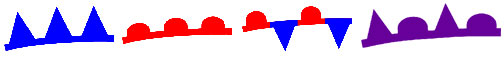
The surface analysis may include one or more color coded lines to identify a front. A front is defined as the transition zone between air masses having dissimilar thermal and moisture properties. Usually, these transition zones are only 50 to 100 km wide, a sufficiently small horizontal distance to permit their representation as lines on a large-scale surface analysis chart. Fronts are classified according to their movement and can be represented on a Surface Analysis chart as follows:
Type Definition Map Symbol
- Cold Fronts - A front where cold air replaces warm air. A blue line with blue barbs pointing in the direction of the cold air flow.
- Warm Fronts - A front where warm air replaces cold air. A red line with red half moons pointing in the direction of warm air flow.
- Stationary Fronts - A front with little lateral movement. A line with alternating red warm front symbols and blue cold front symbols, pointing in opposite directions to symbolize little frontal movement.
- Occluded Fronts - A front where the cold front has overtaken and merged with the warm front. A front with purple (combined red and blue) half moons and barbs on the same side, pointing toward the direction of frontal motion.
Map Interpretation
The surface analysis permits one to identify and locate the large scale features of the sea level pressure field and the surface fronts. Isobars with the lowest value will encircle the region with the lowest point in the pressure field, while the closed isobar with the largest value isolates the highest sea level pressure. The packing of the isobars reveals how rapidly the pressure varies with distance in the horizontal direction. A tighter packing indicates a much more rapid horizontal variation of air pressure.
The isobar pattern is also useful for visualizing the near surface wind regimes. The winds tend to parallel the isobars, with low pressure to the left of the wind flow in the Northern Hemisphere; a slight cross-isobar deflection of the winds toward lower pressure is often seen. As a result, winds appear to spiral in toward a surface low pressure center in a counterclockwise fashion, and spiral around a high pressure cell in a clockwise outflow regime. Additionally, where the isobars are packed more closely, the wind speed tends to be greater.
If previous surface charts are available for the last day or two, you will be able to judge the movement of weather systems over time, based upon continuity principles. You can make a reasonable short range weather forecast based upon the movement of the low and high pressure centers.
A radar image overlay on the surface analysis permits a more additional information about regions of precipitation. The radar echoes provide information about the extent of the precipitation in regions between the normal surface observation network. The intensity of the precipitation can also be estimated from the radar reflectivity and displayed as a series of 6 color codes.